


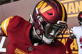


Currently, the NFL is in its offseason; during this time, some NFL teams chose to change up their uniforms. Today, I will share my personal opinions on a scale of A-F for the new designs in the 2024 season.
New York Jets: C
I gave the Jets a C only because the “new” uniforms are simply a throwback look from the 80s. This look made an appearance in their Week One game last season against the Buffalo Bills. The uniforms are clean and the helmets look nice as well. What is bringing the grade down for the Jets is the lack of originality with them. This look has been seen before and I understand the sense of nostalgia for certain jerseys, but that sense of nostalgia isn’t really something to grade the jerseys off of.
Denver Broncos: D-
Where do I begin on how bad these new Broncos uniforms are. They look like they were designed for a high school team. The home jerseys being a bright orange throws me off a little bit. The white jerseys for away games with the navy blue numbers is making me look at it and think it’s a Bengals jersey. The navy blue alternate is a “meh” for me, because I feel like the team could have done more with the design. The sleeve design on all of the jerseys are very basic and don’t have a lot of flash to them which makes me want to yawn when I see them. The helmets for the home and away sets are pretty much the same as their old uniforms. Additionally, the white helmet for the alternate navy uniform just does not make sense to me. It looks like a giant white dome over a dark colored jersey. However, the one thing that is keeping the Broncos grade from being an F is their throwback alternates from 1977. These jerseys are a classic. The brighter shades of blue are much better looking with the orange than the navy. The helmets for the classics is this shade of blue and the logo on it is the same classic logo that has the Bronco inside the letter “D.”
Detroit Lions: A+
This redesign of the jerseys was very much needed. After the Lions had their previous uniforms for a few years — which includes those awful gray uniforms — the Lions opted to change things up a little bit. The home uniforms are a redesign of the 1990s Lions home jerseys with a new modern twist. The road uniforms are simple, but done in the right way. They didn’t need to do much with it and that’s exactly what the Lions did. The jersey is white with some honolulu blue accents and has “Detroit” going across the chest. This jersey is simple and it gets the job done. What is boosting the Lions’ grade is their new black alternate jerseys. The Lions haven’t worn black since the 2000s and now they have brought it back. Just like the others, the black jersey is simple done right. It emphasises the grit and grind mentality of head coach Dan Campbell. The biggest win for these uniforms is the helmets. The helmets are just like the blue helmets the team used last year, but they took the old school Lions logo off and added a new logo that is basically an all black Lions logo. This combination fits well together and I am very happy that the Lions ditched their gray jerseys for the black ones.
Cleveland Browns: B-
There is not much to say about these other than the fact that these are simply classics. The team emphasized such with returning to using a white face mask on their helmets. That change is the only one the team made this offseason, hence why the grade is a B-. The uniforms are good and this change made them a bit better.
Houston Texans: A-
Just like the Lions, the Houston Texans desperately needed a fresh set of uniforms. The team has never altered their uniforms in the history of the franchise until recently. The Texans took their look of sharp battle ideals and made it into a beautiful uniform. The colors match really well together and the font on the jerseys is perfect for the team. The Texans alternate red jerseys are also beautiful along with the new red helmets. The team gave the helmet a new look by only featuring the bulls horns. This was done very nicely. The Texans rolled out another alternate jersey that pays homage to the city of Houston which features the teams traditional colors while boasting a baby blue — a color synonymous with the city of Houston. The jersey has a beautiful font and the logo on the helmet is well designed.
Now that I have graded the new uniforms for the NFL, all we can do now is sit back and wait for the new season of NFL football.