


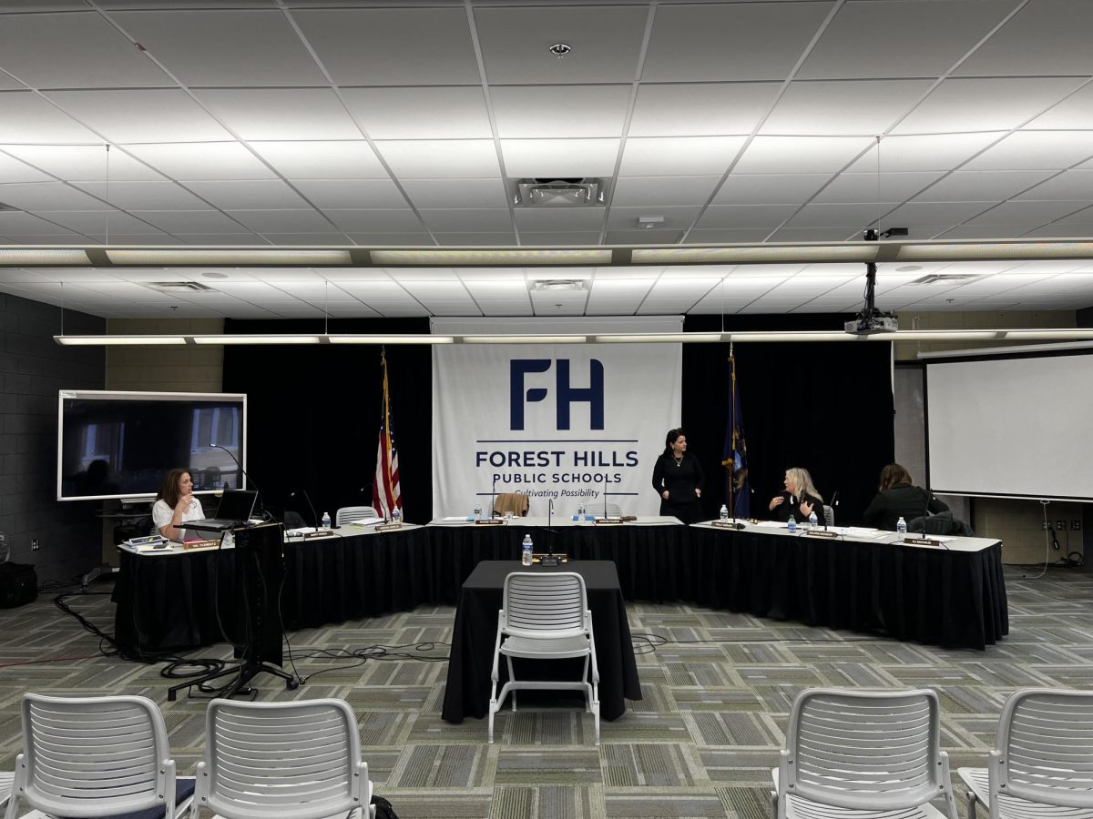


The opinions in this article do not reflect the views of Forest Hills Public Schools.
Sometimes a rebrand for a professional sports franchise is a neat way to spruce things up and give the team a new identity. However, some sports teams have such an iconic look that they can never be changed, such as the bold blue star of the Dallas Cowboys, the famous football-shaped English “G” of the Green Bay Packers, or the deep red with blue outline of the Montreal Canadians. These logos are more than just an image to represent a team, they capture history. Unfortunately, not every logo can get the same status as those logos for mentioned.
Most teams have changed their logo a few times in the past, and sometimes the rebrand gives the team a fresh style that their fans love; other times the rebrand is faced with criticism and/or hatred from the fans. More recently, when teams go through a rebrand, the logos have taken a new approach. This new approach is simple logos that convey the image. Sometimes simplicity works, but in terms of a sports team, I firmly believe that simplicity in logos does not belong.
Sadly there are too many examples in recent years of teams ditching a well-detailed logo for a logo that has 1-2 colors and minimal details. For example, while looking at college-level athletics, one rebrand that I believe could be better is Western Michigan University’s 2021 rebrand. They took a logo that was full of life and fine detail and replaced it with a logo that has less details and less color. The university also decided to use their bronco logo less after the rebrand as a tactic to consolidate their logo lineup.
College sports are not the only ones adopting the simplicity approach though. In fact, professional sports teams do not shy away. Some recent rebrands have had similar results. In 2020, the Los Angeles Rams gave the team a new look after moving into their brand new five billion dollar Sofi Stadium. They gave the team modern colors of blue and yellow. While I appreciate the colors, it’s the logo I have less favorable opinions on. To begin, the Rams’ primary logo is just “LA” in a basic font with ram horns attached to it. The alternate logo is a step better than the primary only because it actually has the rams head on it. However, the outlining of the logo creates a distinct image that may not kid friendly, causing some certain backlash from other fans.
Additionally, the Brooklyn Nets completed a rebrand when they moved from New Jersey to Brooklyn in 2014. They went from a red, white and navy blue team, to simply using black and white. While a classic color combination, in the world of sports, black and white logos can seem boring or uninteresting to fans. Not only did the rebrand replace a perfectly good color pallet, but it also caused the jerseys to change as well. Whereas before the jerseys had the classic red, white and navy with the original logo, they now are merely black or white with “Brooklyn” spelled on the front. Their new logo is as simple as it can get as well — a black shield with the team name and a letter B inside it colored white.
Moving on to yet another sports team is the Detroit Pistons, which underwent change back in the 2000s. They changed their logo from a sleek, teal horse with “Pistons” over it in a chrome color and even some letters being attached to a flaming exhaust pipe to a red basketball that says “Detroit Pistons” in a white font. The new logo looks like a logo that you could create in NBA 2K. The logo change caused a change in the jersey design too. The most obvious of which being the colors. The one thing that bothers me is that the pistons took that basic font that they threw in the new logo and printed it on the jersey. The previous pistons jerseys had the horse and flaming exhaust pipes on them. Can you see the downgrade here?
Additionally, the Utah Jazz went from a logo featuring many colors such as navy, gold, green and white — which gave the jazz many creative outlets for alternate jersey designs — to a simple black. The jazz ditched the navy, green and gold and replaced their primary colors with black, white, and neon yellow. I do have to give them props for bringing back their classic mountain purple designs every now and again. However, I still prefer the original logo to their new ones.
While there are quite a few mentioned above, these are just a few examples of rebrands that sports teams have done in recent years that I personally believe don’t do the teams justice. Over-simplification in sports logos is a practice I hope begins to fade out in the coming years, allowing teams to realize that logos don’t always have to be changed to fit a modern narrative; instead, remaining classics in some aspects is a positive things and should be embraced more often.